Junior UX/UI Designer
Junior UX/UI Designer
Junior UX/UI Designer
Penni: an e-wallet
Penni: an e-wallet
Penni: an e-wallet
Role
Role
UX/UI Designer
UX/UI Designer
Tools
Tools
Figma, Google Forms, UsabilityHub, WCAG guidelines
Figma, Google Forms, UsabilityHub, WCAG guidelines
Timeline
Timeline
Nov 2022 - Jun 2023
Nov 2022 - Jun 2023
Overview
Overview
Overview
The Brand
The Brand
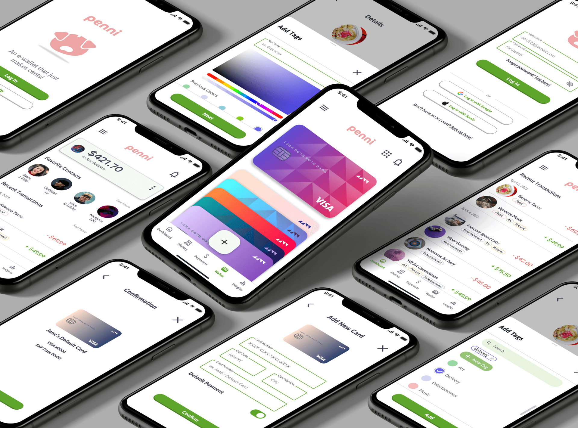
Penni is a responsive web app that allows users to transfer money safely, gain insight into their spending, and shop, both in-person and online, all in a single app. No physical cards or wallets necessary! Simply, an e-wallet that makes sense.
Penni is a responsive web app that allows users to transfer money safely, gain insight into their spending, and shop, both in-person and online, all in a single app. No physical cards or wallets necessary! Simply, an e-wallet that makes sense.
Problem Statement
Problem Statement
Users need a way to securely shop, pay, and manage their money in a single location because they want to feel more efficient, safe, and in control of their finances.
Users need a way to securely shop, pay, and manage their money in a single location because they want to feel more efficient, safe, and in control of their finances.
In order to create an enjoyable and accessible user experience, I had to gain insight into Penni’s potential user base
In order to create an enjoyable and accessible user experience, I had to gain insight into Penni’s potential user base
In order to create an enjoyable and accessible user experience, I had to gain insight into Penni’s potential user base
Data regarding spending habits and online transactions was collected through user surveys and interviews.
Data regarding spending habits and online transactions was collected through user surveys and interviews.
Goals
Goals
Understand users’ needs in e-wallets and mobile payment methods
Understand users’ needs in e-wallets and mobile payment methods
Document user opinions on competing sites or apps they currently use
Document user opinions on competing sites or apps they currently use
Gain insight into the kinds of shopping users do and their payment methods
Gain insight into the kinds of shopping users do and their payment methods


Affinity Mapping
Affinity Mapping
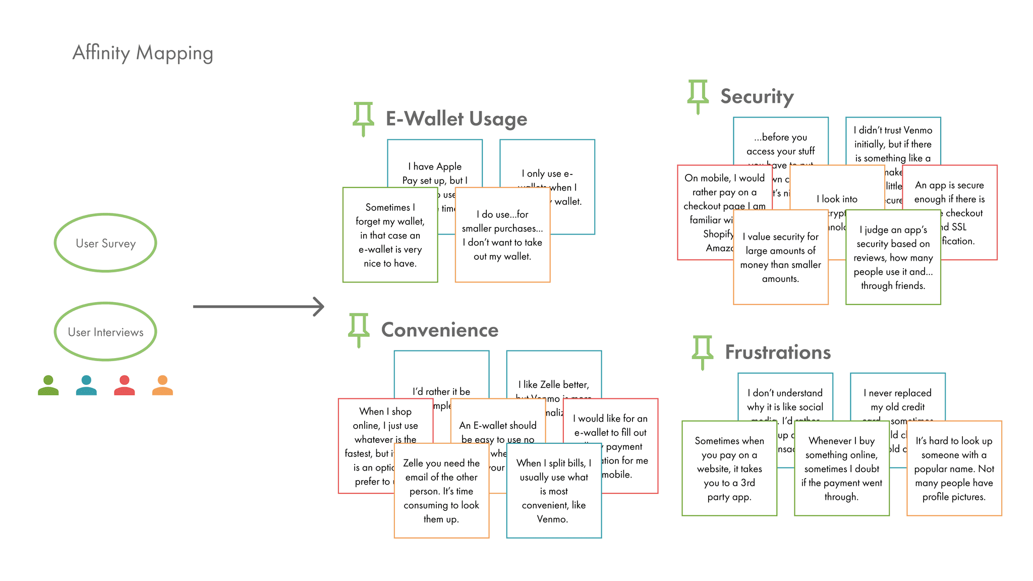
Through affinity mapping, I saw some common lines of thought and concerns across a wide variety of users. This lead me to some very important insights:
Through affinity mapping, I saw some common lines of thought and concerns across a wide variety of users. This lead me to some very important insights:

Current e-wallets don’t provide a sense of security and control
Current e-wallets don’t provide a sense of security and control
Current e-wallets don’t actively notify users of their utility
Current e-wallets don’t actively notify users of their utility
Because e-wallets have yet to be universally accepted, users may find themselves needing to use a physical card anyway
Because e-wallets have yet to be universally accepted, users may find themselves needing to use a physical card anyway
While users generally do value security measures, users still want relative ease when paying
While users generally do value security measures, users still want relative ease when paying
Users will use apps that seem less secure if it is widely used by others for the sake of convenience
Users will use apps that seem less secure if it is widely used by others for the sake of convenience
When apps don’t provide communication about important changes, users feel insecure about using e-payments
When apps don’t provide communication about important changes, users feel insecure about using e-payments
Information Architecture
Information Architecture
Users need to easily digest the information on Penni and be able to navigate their way through the app intuitively. I set up some card sorting sessions to help refine Penni’s sitemap.
Users need to easily digest the information on Penni and be able to navigate their way through the app intuitively. I set up some card sorting sessions to help refine Penni’s sitemap.


Designing for humans
Designing for humans
Designing for humans
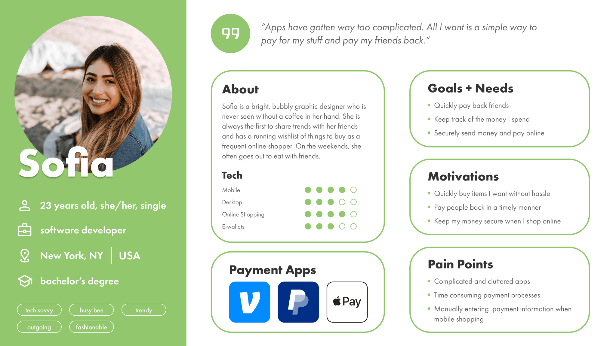
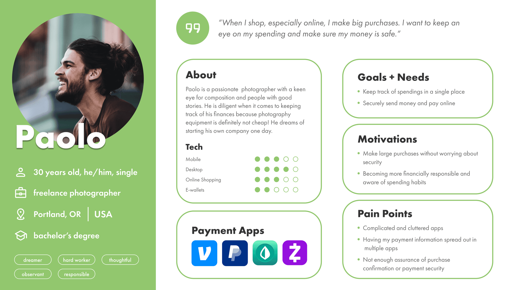
To help humanize Penni’s users, I took the data gathered from user interviews and affinity mapping to introduce two very important people: Sofia and Paolo!
To help humanize Penni’s users, I took the data gathered from user interviews and affinity mapping to introduce two very important people: Sofia and Paolo!


Creating user flows
Creating user flows
Creating user flows
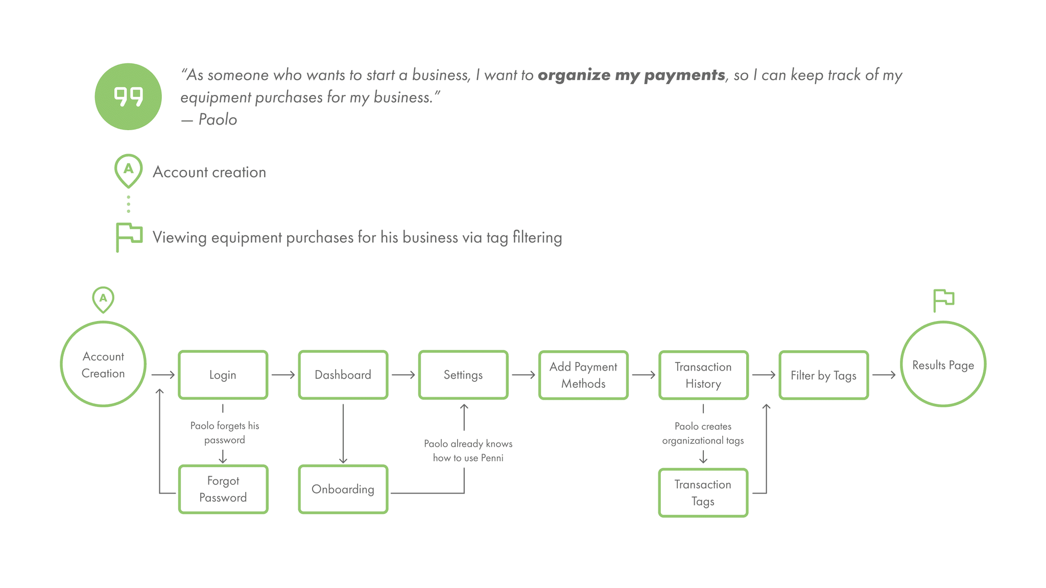
Keeping Paolo and Sofia in mind, I drew up user flows based on their needs, such as: adding a payment method and searching through payment history.
Keeping Paolo and Sofia in mind, I drew up user flows based on their needs, such as: adding a payment method and searching through payment history.

Bringing the elements together
Bringing the elements together
Bringing the elements together
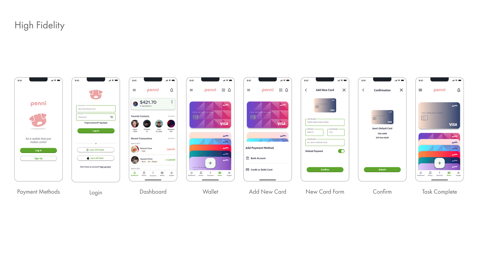
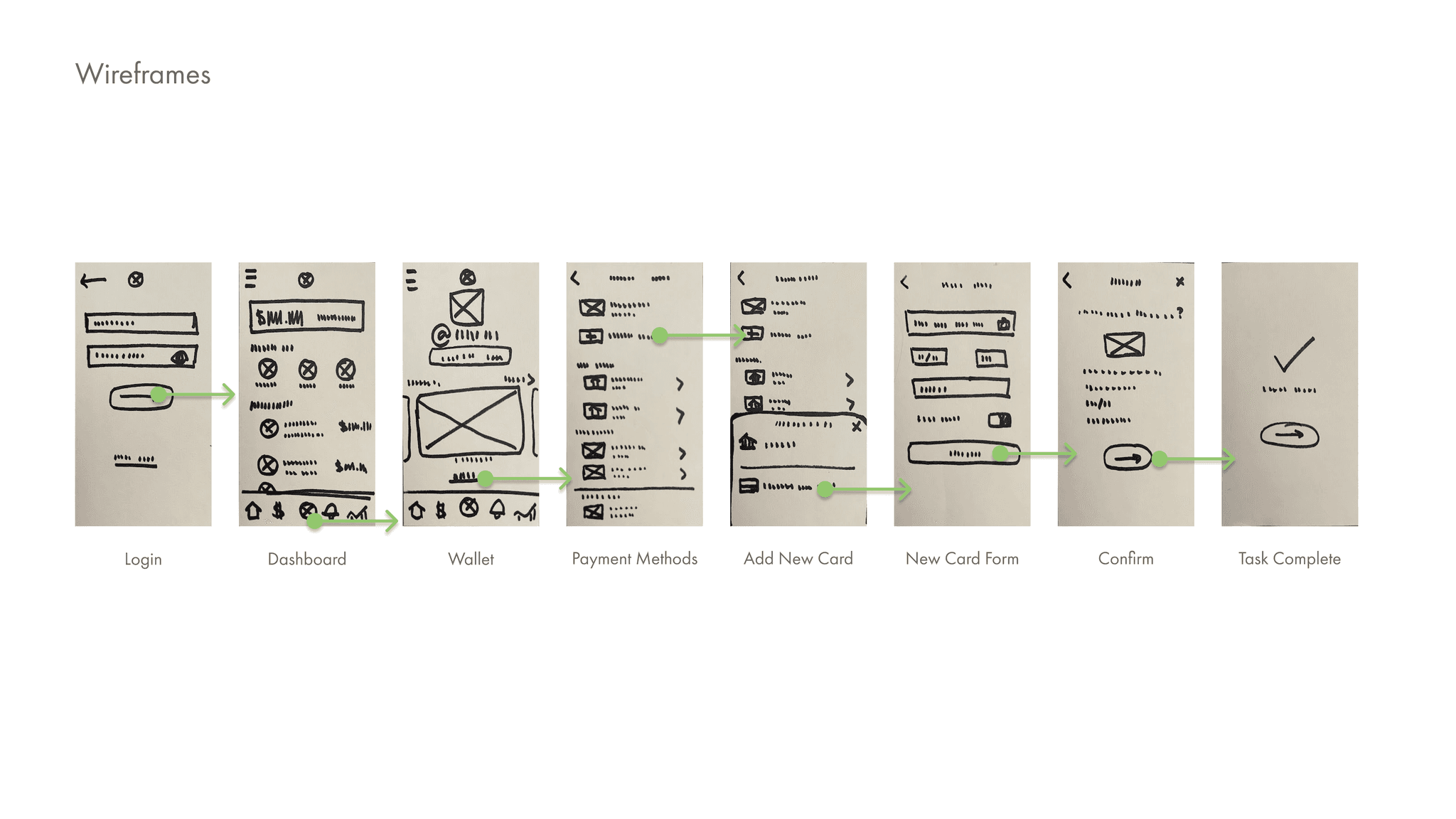
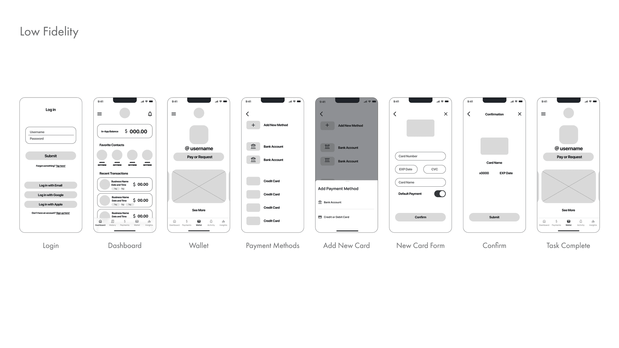
Paper and markers are my go-to weapons of choice when it comes to tackling wireframes. I took what I learned from user research and the user flows I developed, and began to sketch out some initial designs to make my first set of wireframes and low-fidelity prototypes.
Paper and markers are my go-to weapons of choice when it comes to tackling wireframes. I took what I learned from user research and the user flows I developed, and began to sketch out some initial designs to make my first set of wireframes and low-fidelity prototypes.


Putting my designs to the test
Putting my designs to the test
Putting my designs to the test
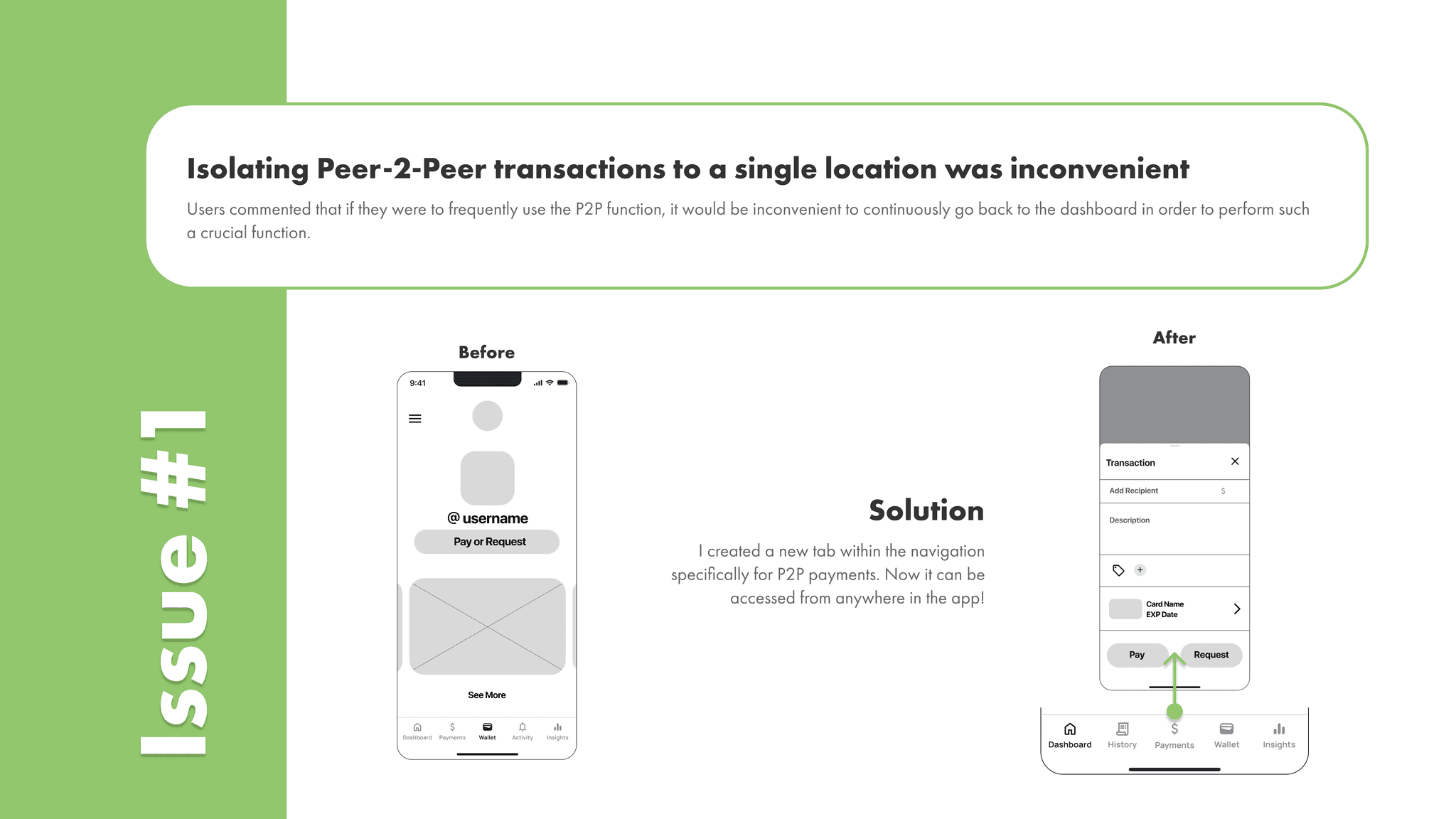
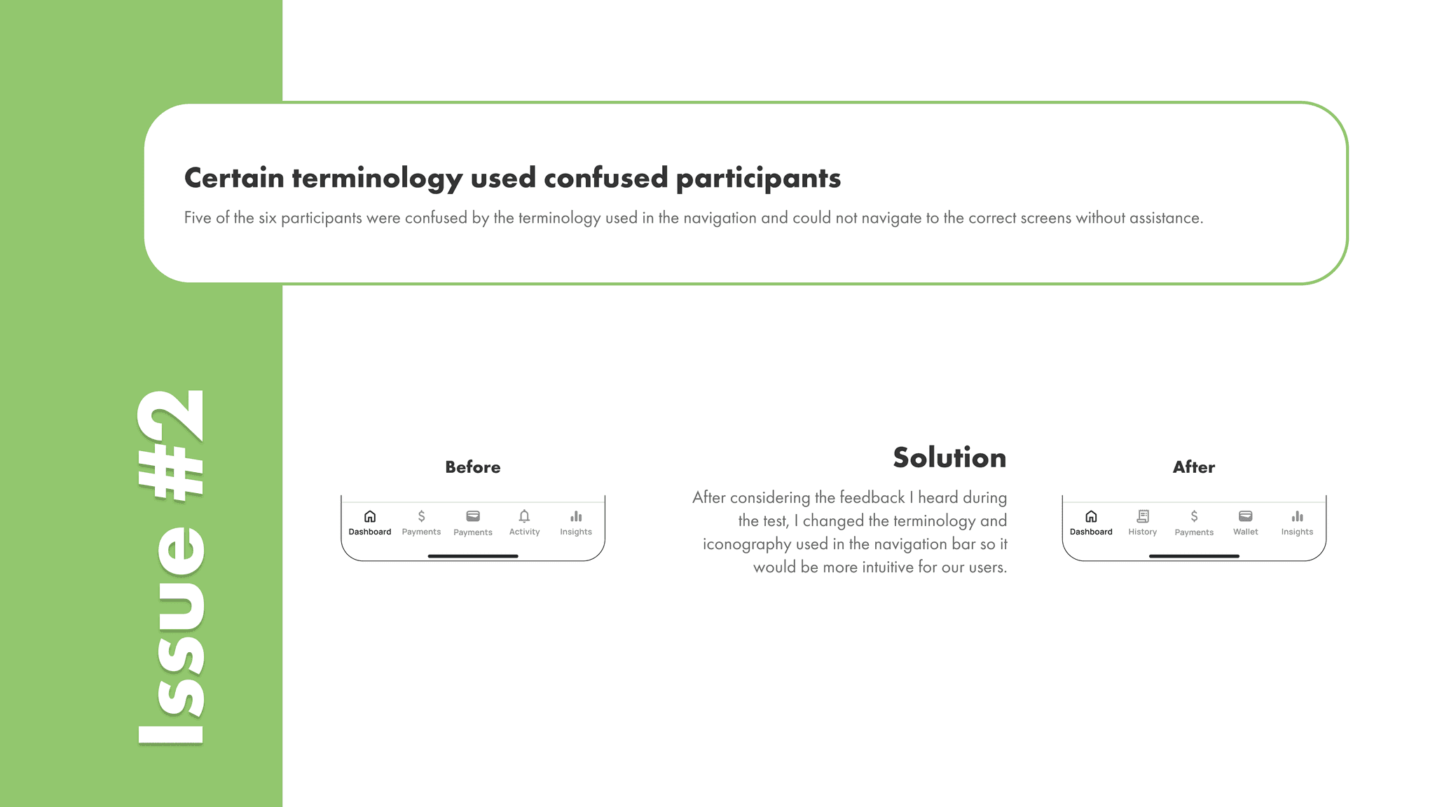
Now, I needed to put my screens to the test.
Were my designs intuitive? Or did they create points of friction that I didn’t consider?
I conducted usability tests with 6 participants to see their thoughts and feelings on Penni’s prototype. As expected, not everything was perfect, but I quickly turned feedback into solutions.


Designing for accessibility
Designing for accessibility
Designing for accessibility
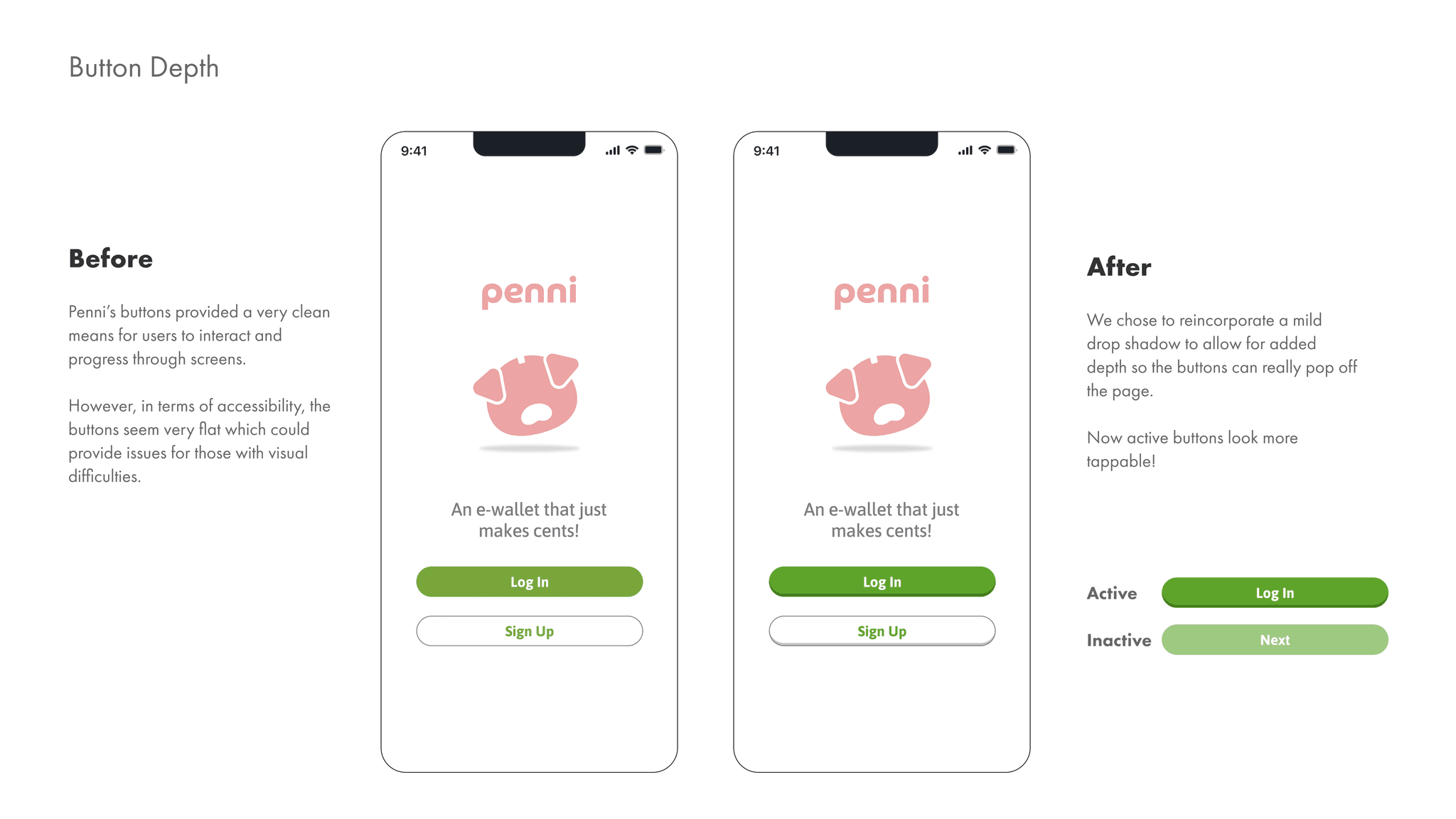
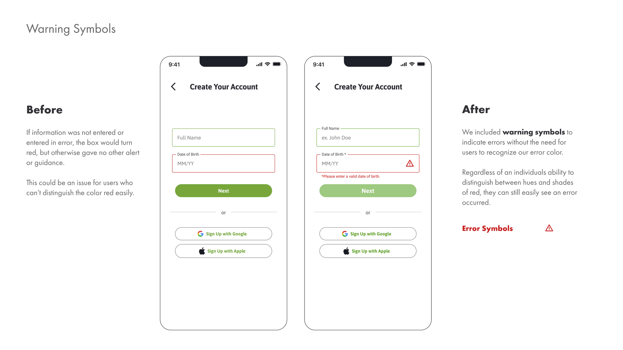
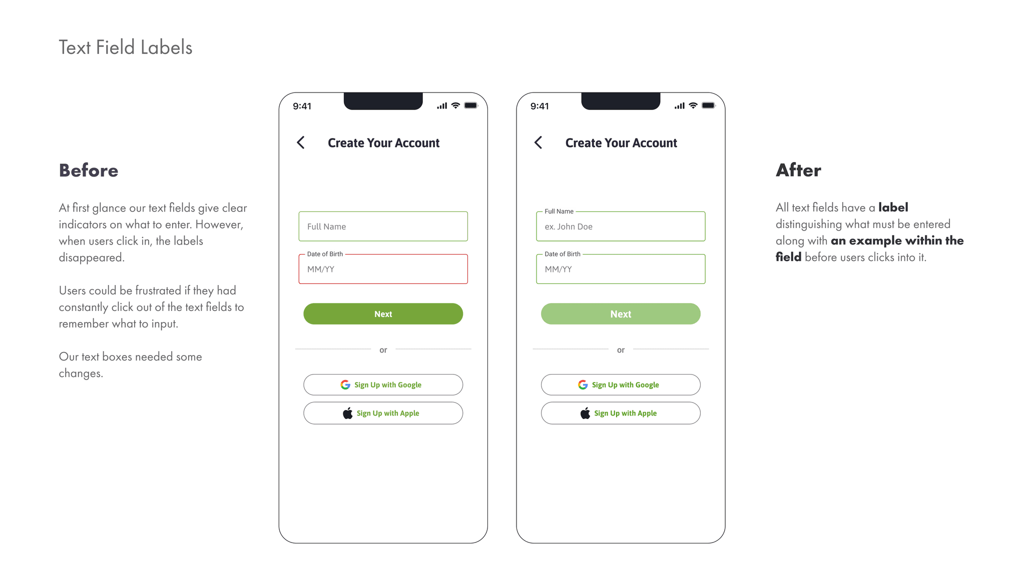
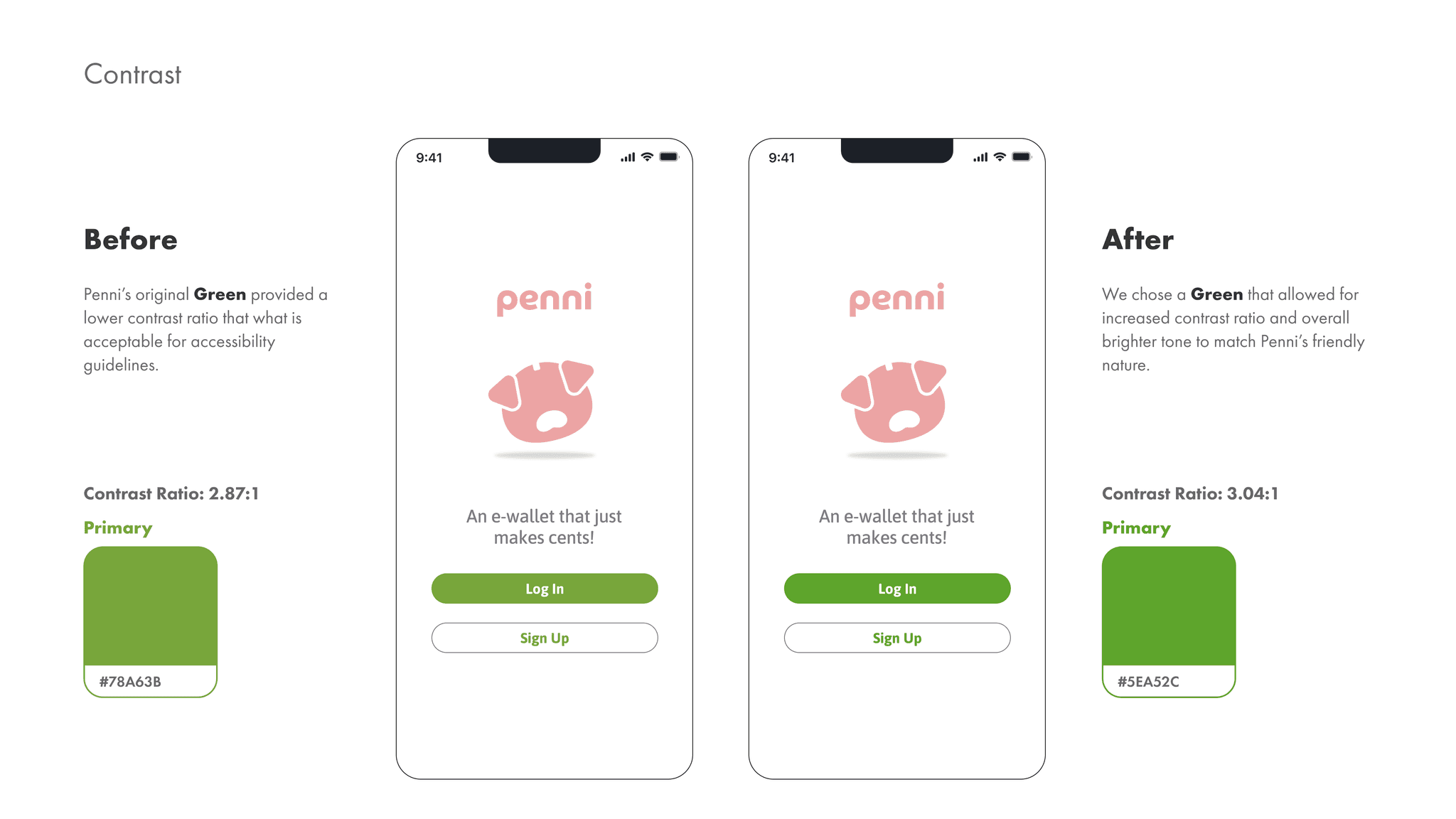
Ultimately, I want to ensure I am designing for users of all abilities and walks of life. To cultivate a truly good user experience, I need to ensure inclusivity is at the forefront.
Keeping WCAG guidelines in mind, I went back to revise Penni’s screens.
Ultimately, I want to ensure I am designing for users of all abilities and walks of life. To cultivate a truly good user experience, I need to ensure inclusivity is at the forefront.
Keeping WCAG guidelines in mind, I went back to revise Penni’s screens.
